
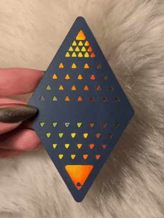
The first of The KEYS ⨺ 16(32) prototypes (KEYS 2 and 3) were created the night of April 18th, 2026, in a creative frenzy. A video was uploaded too. Inspired by the latest new pieces for The SOLVE ⨺ 18(36) and COAGULA ⨺ 27(54) Sets which looked so beautiful, I couldn't resist charging through card face designs for the entire 7 of 9, instead of backs or further writings right now. I also felt having card faces done for every set first would support me in presenting the work in progress on Meta in a more visually exciting way. So, I've begun that creative journey. I'll try to balance writing and design as I go through this.
As I write this on April 30th, the bright red design you see here has been completely abandoned in favour of new designs that were inspired by its creation. It serves as a great story of how my artistic choices unfolded. It was actually a very spiritual experience, which matches perfectly with The 16 KEYS which are themed around miracles.
In the photos you see here, you can catch a glimpse of the early hand painted prototypes I created for The 16 KEYS, configured into diamonds on my wall. After getting so acquainted with this arrangement of triangles in my home, I decided to join the two triangular designs for The 7 of 9 into a diamond for a larger format version that I could use as decoration for myself.
This process made me realize that it would be perfect if I would use these for a distinct presentation of The 16 KEYS which holds its own space on the website. In fact, I had wanted to present the writing for The 16 KEYS in another distinct way anyhow, so this seemed to perfectly fall together as the ideal imagery to go with that. And so, The 16(2) was born.
Intuitive Design Inspiration From Marilyn Manson

I'm so honoured to be able to say that I have a very strong intuitive or spiritual connection to Marilyn Manson which brings me so much joy every day of my life. I've written about that very unique spiritual connection I feel to him very indepth in my UNITY LIFE Archive SELF-REALIZATION IS CHIC. But assuming some readers may be new to the idea of intuition, I wanted to feature the one you see in this image here, so that you can get a picture of what intuition is like for me. Or check out this quick UNITY LIFE Glossary entry on the term. Well, I thought it would be nice to say it here that this very powerful connection made a major impact on how the design for The 16 KEYS progressed from this point. I felt Brian's presence (Brian is his real name) come over me very strongly when I was observing the difference between this new purple design and red one. It felt like his influence to recommend going epic on little triangular intricacies in the red one too.
Here you can see all the versions of this design that came out in a process inspired by Marilyn Manson, which ended up having a huge influence on the entire series. At the end of the slideshow there is also a reference image to the design I was working on after this one. Initially I came to my own conclusions that for a larger format, it would be important to round out the larger shapes. After some experimentation with how much, I decided to use numerology which is central to UNITY LIFE to make my decision (which looked best anyway). I rounded the larger shapes by 1.44 mm, and the smaller ones by .72mm. That was perfection.
Then I received a huge inspiration from Marilyn Manson which I feel is a great example of how sometimes it just doesn't practically feel like it was really my own idea at all. For certain reasons of my own concerns about a method of ensuring all the designs look equal to each other, I had been closed to more intricate triangular grids or small triangles within larger shapes for this red design. But I felt Brian's spiritual influence strongly suggesting that this would resolve visual inequalities between this red one, and the purple one that followed, rather than make them worse.
This was a case of just following an intuition even though I didn't logically see how it made much sense. Normally I'm guarded against that, because I just prioritize my own internal logic to stay grounded. But it just felt right this time to take the risk of wasted materials and keep pushing this red design based on what seemed perceptually to me as though it was Brian's ideas. This completely worked out. Not only did it greatly increase the beauty of this red card, but it also caused me to abandon this whole entire design in favour of redoing it to make room for even more of these types of intricate shapes. Now the later cards are taking that direction more strongly and they look incredible.
In retrospect I felt it was a good example of when I should follow what feels right and take a risk in order to allow spiritual intuition to be prioritized over logical choices — not only because it worked out well, but because it makes for a great show to be able to tell the story. Discussing my spiritual connection with Brian really has been a UNITY LIFE topic, and I think it's thematically appropriate to bring that out within The 7 of 9, in which he is so prominently featured as a core inspiration of the set.
Work In Progress Photos
I tried to save a lot of photos of the process of developing all these. I find work in progress imagery can be really beautiful in its own way too. I have a few notes to go with the pictures :
⨺ I found that the smaller cards are more challenging to cut perfectly, which has led me to consider increasing the size of The 7 of 9, and put a lot of thought into possible other solutions in the long run (such as changing materials). Regardless, I thought the use of delicate scissors and a nail file to perfect them was a beautiful way to illustrate just what an original and unique piece of handmade artwork each piece is, despite being from a digital design.
⨺ I've been rolling around many different ideas in my head for how to do The 7 of 9 game mat, as well as what type of packaging it should come in. Right now, I'm leaning into soft solutions like just a large draping piece of velvet for the mat, and a soft pouch with really nice bags for card filing, but I also think there's a lot more I could potentially dream for it than that. It's such a process to think about how to practically make items like that. At least, a large draping fabric is so nice for the way that taking photos of your 7 of 9 layouts will always lead to great pictures, without any awkward end to the mat falling into your image.
⨺ Since I own a laminator, I've been especially transfixed with ideas of how it could somehow be used to create a new format for The 7 of 9 using lamination sheets and perhaps vinyl or wrapping paper of these colors. It seems that type of format would obviously be lower quality due to the cardstock not raising the front layer to create such a tactile and visual appeal — yet could save so much time that it makes The 7 of 9 at least reasonably affordable to buy. That said, my hope is that in the end it will actually seem better, thanks to some ingenuitive discovery.
⨺ As you can see, this process led me into a third design eventually, and I've added my digital screenshots here too, as they look so cool.
⨺ Also, on a more personal note, I got a new waste bin at the dollar store for project waste, and I couldn't believe it was so geometrically inspired :)) So ideal for this artwork (lol). At the same time, I had the revelation that for a savory waffle recipe, you can just put savory dishes which are not a waffle mix at all into a waffle iron. I love the results :))
Intricacy of KEYS 15 & 16
Thankfully, before wasting cardstock by doing these in the wrong color, I realized that it would definitely be strategically optimal to re-order, re-color-code and re-number the entire set at this stage. It occurred to me that doing something really new and special with that layer of the design — if it was a really incredible idea of how — would make the release in this revised format much more exciting for everyone. I did that, which perfectly still allowed the earlier red one to remain red and be the same KEY Pair it was already released as (aside from changed numbers) — thankfully without sacrifice of quality at all to this exciting new structure.
Here in these photos you can see that the early mockups of these designs for the purple one(s) were in red and green. Now — unlike before — these DESIGNS represent KEYS 15 (MATERIALIZATIONS) & 16 (DEMATERIALIZATIONS). In a previous 7 of 9 Process Artifact Journal Entry, I had shown these painted mockups and said that these particular designs were abandoned out of concern that they would be too intricate for a dye cutter in the planned small size of the cards. But now, I knew that in this larger format there was nothing in the way of these prettier, more ornate looking versions — so I decided to try my hand at it in the large and small format, to see for myself if it was possible in a micro scale.
I the end, I was pleased with the way it looks very intricate in such a smaller format, but not completely content. This has gotten me constantly wondering, totally back and forth, with what I should do. A part of me is considering starting the whole 7 of 9 over again from the start, making all the cards into a larger format to accomodate for more intricacy — although that would be such a waste of work and photography so far. I will probably take a different approach than starting over, but I'm still very undecided if I should use intricate designs for the small 7 of 9 cards or do a whole other more simplified design. It's so hard to say.
A Rest To Contemplate
Periodically, I like to rest by working on other things while taking that time to reflect on how it's been going. One exciting development in other tasks involved the discovery of how to put animated gifs on this website, leading to animated plates. It was so much fun making the decision to have video and gif animated plates instead of stills, and updating the website to have many animations. I also really enjoyed adding 16 KEYS products to The UNITY LIFE Shop (some of my first products), and I loved how the shop feature on this site worked out. As well, I can't express how much joy it brought me to see these designs coming out so well. At the same time though, I was amazed by how much longer it's taking me to accomplish the designs for The 16 KEYS than it did for the SOLVE et COAGULA. I'm nervous that it's taking so long, since I can't wait to unveil the so far semi-secret UNNAMED set. But it will be well worth the time, as The 16 KEYS have been a core UNITY LIFE resource for many years since 2019 and they do serve an incredible purpose. I can't imagine how much it will support me to have them done so well in this new format.
Reflecting On My Personal Connection To The 16 KEYS
Here you can see the gorgeous version I've been working with for years now which is about to be replaced.
The 16 KEYS have not just been one available UNITY LIFE resource since the earliest of my path of creating art with the media, but it has also been always something which means the world to me emotionally on many levels, which I think about all the time, and which I feel appeals greatly to all my favourite stars. This type of artwork really has emotionally supported me to overcome my fears of scepticism and disrespect from the people around me for being so invested into theorizing and contemplating on these matters. In my life, I am often told to shut up or speak less, that I'm delusional or crazy, or that I'm stupid or misguided when I bring up any unusual ideas like this. Talking to a well educated friend I was fascinated by his view on this. He said that his University education has really shown him that that's because I'm a woman. He learned deeply in his psychology path that women get treated like that all the time, while for men it's just not the same way. I was surprised that he also thought it's applying to me fully even though I'm white, since gender has more impact on this. Well, I probably worry too much after being so disrespected so often, but I'm very proud of how I've adapted to those types of challenges by using this type of artwork as a tool to make it seem much more well thought out and respectable — which of course it is.
I can't tell you how much it's meant to me emotionally to have these visual tools to back myself up and develop a way of being able to open up and be honest about some of the things I think matter the most in life. It's become more true than I anticipated that sometimes visual communication can be a way to break silence and cancel censorship. Plus these truly are revolutionary ideas, so I've found they really deserve this type of beautiful treatment for them.
The new development of actually making this into a playable game truly has lifted my spirit to all new heights, in adoration of the adaptation and next level of personal empowerment this represents for me. It's boosted my confidence so much. The old way would have been to assume that it's only a tool for me, but now I can easily see the value in producing it for sale so that others can use it too — even if they are completely new to these ideas. Becoming not just a next level artist — but an artist facilitator thanks to this — really is bringing out my joy. This makes me see so much more the potential I've always had, even when I was the most battered and insecure without these tools.
Even in the worst of times of my life, I knew my power and I knew who I was — such a mindblowingly beautiful human being — but a part of me fractured and imagined that because others don't recognize that, it's as if that powerful truth just lives in a closet or separate part of me. After how hard I've worked to rise above, I feel like this new artwork is what I really deserve. Frankly, I'm very into eye candy and even just stuff like any rainbowy gold holographic materials alone — on anything — have always been enough to tickle me to a deeper inner bliss-out. So this is extreme what kind of joy I get out of this. It's a gift to myself which reflects my own truth right back at me.
Draft Designs That Were Replaced
June 2nd, 2026 : Throughout the creation process, some drafts were replaced. I'm now starting a gallery of these abandoned drafts and I look forward to adding the stories of what happened with each one.


Add comment
Comments